As some who read this may know I’m involved, well currently the project lead, on the Exeter Radio Telescope at Caradon (XRT-C) project. The idea behind this project is great; to build a professional grade, 4.5m radio telescope in the Cornish country side that can be used by students across the UK. Up until now, that aim has seemed like a bit of a pipe dream. For reasons I shan’t enter into in this post we’ve had many, many delays over the years, but the project is finally reaching completion and we have all but one of the components needed to complete the telescope and begin commissioning. Because I saw this momentous occasion coming up, I wanted to mark the occasion by taking the old, run-down and somewhat decrepit website I hurriedly put together a few years ago and make something much more professional looking that the project could be proud of. Once again, I pulled my toolbox of modern design trends and set to work. You can see the finished result here. Let’s just stick it toe to toe with the old one and see what we’re dealing with here.
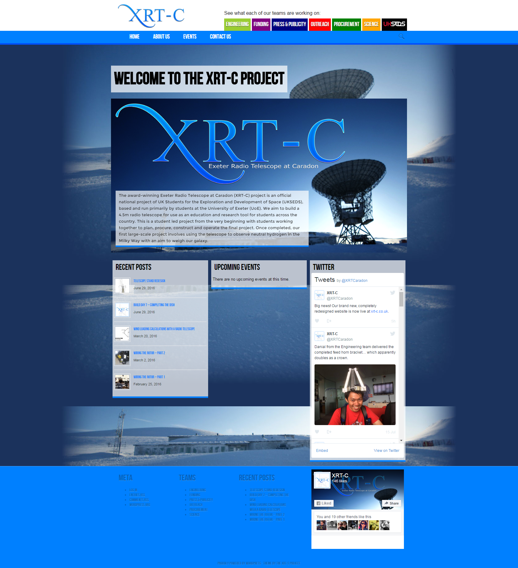
The old XRT-S site. The design itself has seen better days and it’s plagued with legacy things that I’ve just never got around to fixing. All in all, it was due for a change.
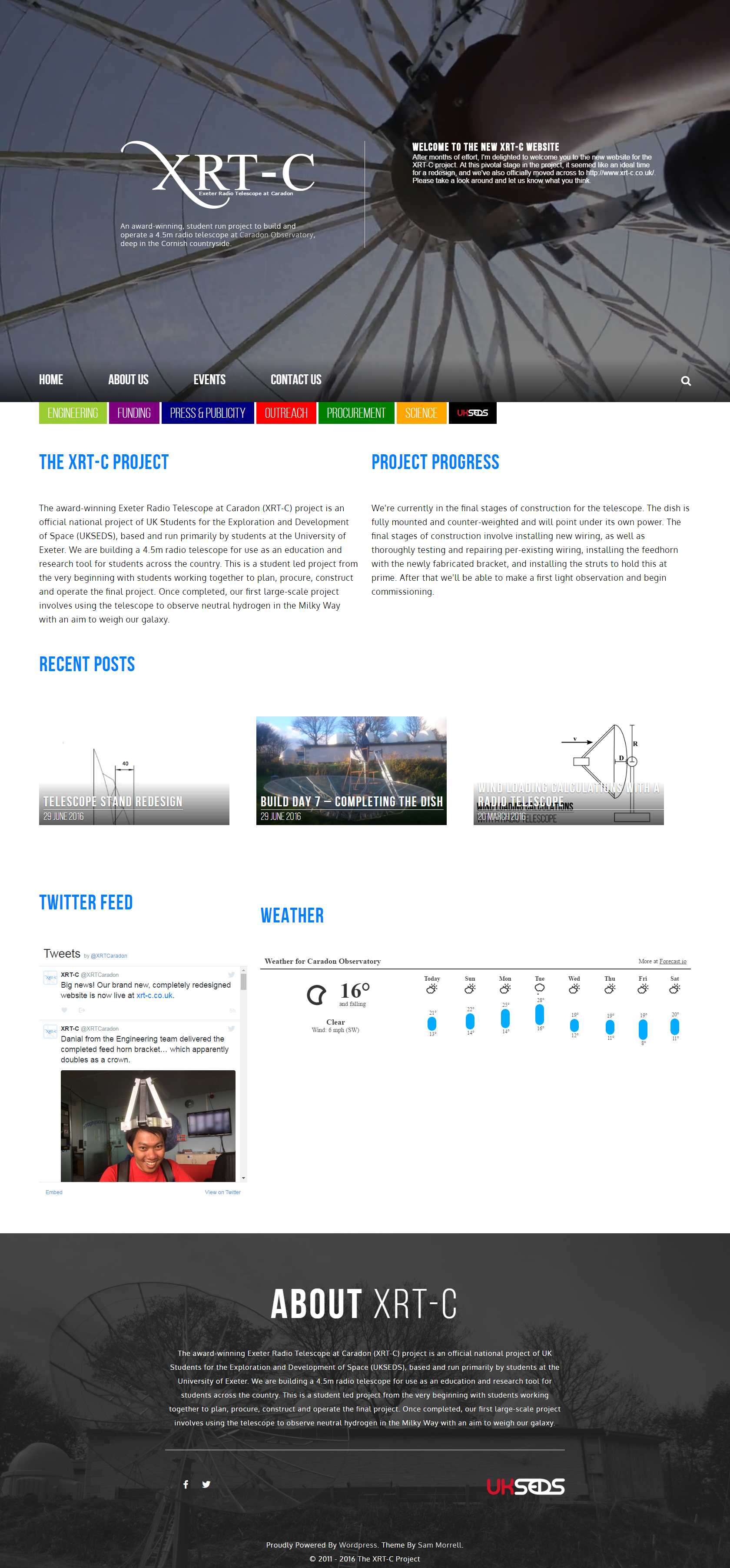
The new site has a nice, spacious flat design that. The flexibility of the theme means that it should last the project for some time.
The first thing that will probably instantly strike you about the old website is that it’s very, well, blue. We originally went with this colour of blue for the logo and I abused it a little in the colour scheme. This, combined with the stark colours used for the team colours gave the whole site a kind of toy-like cartoony feeling; definitely not as professional as it should have felt. The other major issue, and this one isn’t entirely my fault, is that the original site was built right on the verge of responsive design becoming mainstream. Because of this, I didn’t invest the necessary time I should have done to make the markup and stylesheets behave when shrunk down to a phone. This was also not helped by the fact that a must have feature for that time was a massive slideshow on the front page. At the time, these things still weren’t all that well optimised for phones, so that locked me in to a fixed width design and we stuck with it until now. Another slightly less troublesome, but still quite major, factor in this theme’s demise is that the background of the site was designed around a very nice photo provided by the then outreach officer, Hannah Wakeford. At the time it was all we had, but since I’ve been maintaining a fairly exhaustive archive of photos and videos from build days this is no longer required.
Let’s now take a look at the new one. First item on the list was do away with all of the blue and all of the photos of other people’s telescopes. Since we have our own now, keeping that as the background is a little silly. So to contrast the cramped, fixed width design of the old site, we have a spacious, flexible width design with plenty of white-space this time. The font on the old site was also amateurish looking, and at the best of times looked hastily cobbled together. This time around I’ve spent a long time tweaking the letter- and line-spacing so that it looks legible and well presented on all displays. The main set piece of the whole presentation is the large, fullscreen masthead at the top of the homepage, which presents a montage of video that I’ve collected. I know it’s the cliché thing to do, but I liked it, and it is a striking thing to present first time visitors with. The other thing that always plagued the old site is the somewhat lacklustre presentation of post excerpts, such as in search, recent posts and category listings. This time, I’ve designed my own widgets for this and put together a nice excerpt that makes good use of the featured image and small part of the article, featuring the motif of having the title and date separated by a line that seems to have developed over the past year or so. The footer always looked cluttered, and there was little evidence that having most of that there was actually useful, so I’ve replaced it with a simple bit of text and the necessary social icons.
For the sake of completeness, let’s just also have a quick look at a post on this site.
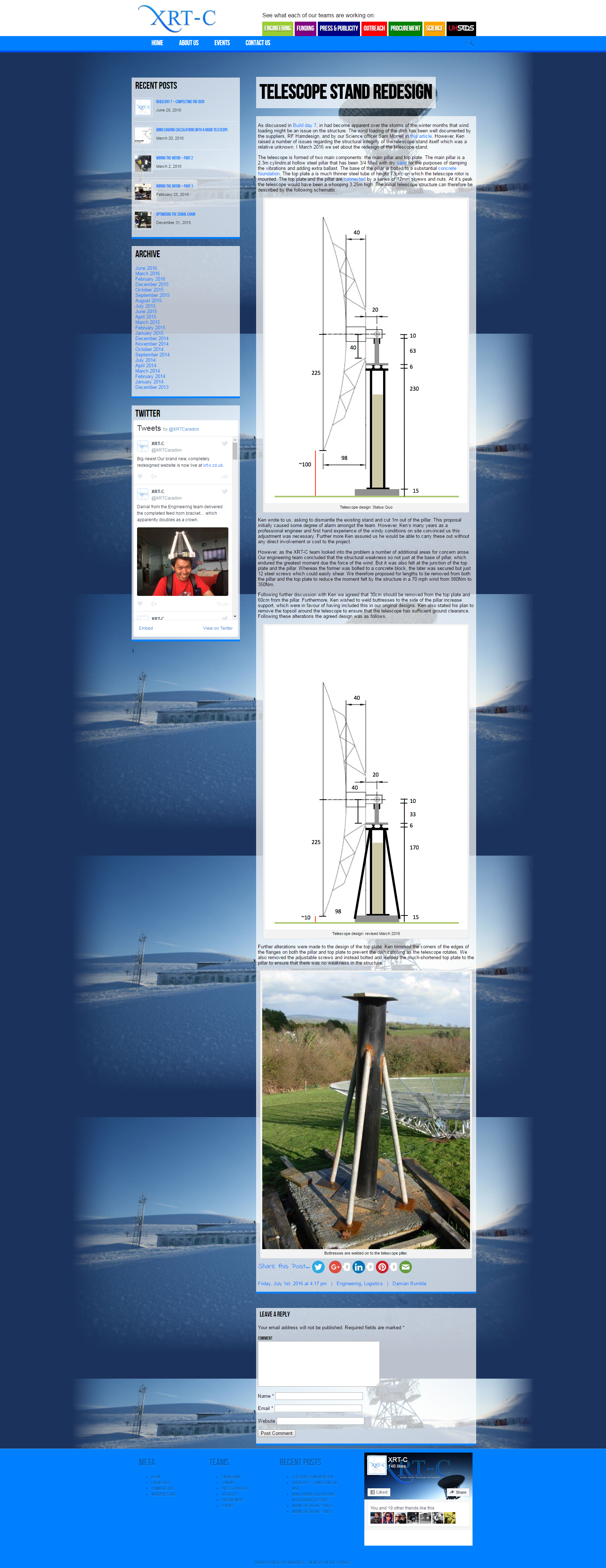
Here’s the full width page of the most recent post on the old site. Even with this stuff it’s a bit of a mess.

The new site as it would appear on an iPad, showcasing the new responsive layout.
Okay, so we can once again see a radical difference between the post page on the new and old sites. On the old one, all of the useful content is crammed into a 500px wide box and the sidebar capitalises way too much screen real estate. In the new design the content is front and centre with everything else fitting in around it. On pages with tags and stuff, that appears below the content. All in all, I’m so much happier with this layout than the new old one.
In Conclusion
Sorry about the brevity of this post, but I just wanted to get a quick something up to acknowledge the redesign and to point you in the direction of the new site so that you can see it for yourself. If you do find yourself in that neck of the woods please do let me know what you think. Until next time, thanks for reading.
