In my free time of late, I’ve been busy beavering away on my latest website. This one has taken a few weeks to perfect and hone but this is the brand new website for my band Soul Traders. This has been coming for a little while, and when you see the old site you’ll understand why. It’s pretty ghastly, by most measures. Let’s go through what we’ve got here.
The old site is a real mess. Each page is it’s own PHP file with the header and footer included onto each page. There’s also an assortment of other files strewn around for good measure. In each of these pages the markup is muddled in with the PHP and the whole thing is a badly commented, syntacticly questionable mess. I should probably bring up that it was actually me that wrote this about 4 years ago, so I’m being totally fair. The site itself is fixed with at 800px, a phase that I went through for about 3 years until I saw the light of responsive design. As a result of this, much to my eventual disdain, this site handles awfully on any sort of mobile device. Considering most of the audience are visiting on this kind of device, that’s a bit rubbish. It’s also covered in a faux metal pattern as the background. At the time it looked quite nice, but time has not treated this site well. In early February I set to work completely rewriting it and this is what I came up with.
What’s In My Toolbox?
First off, we’re once again using PHP. I know it’s not trendy, or even particularly fast, but it is widely supported and I’ve used it… a lot. To make PHP more bearable to use, I’ve coated it in layers of libraries that make it look to a programmer like a slightly stunted variant of Express atop node.js. They are:
- Slim – Slim is the backbone of the entire site. In this project it plays the role of the magnificently multi-talented Express. This library provides a really nice, clean interface to the some what icky, convoluted core of PHP. Its router is actually really awesome, allowing you to not only make nice, SEO friendly routes to all of your web pages, but also allowing you to make a hierarchy of them; sort of like a RESTful API. All of this convenience makes this tool my goto for new PHP projects.
- JadePHP – HTML, well SGML-derived languages in general, are a little bloated and inelegant to develop with. They are very good at representing data, but there’s a lot of syntax that provide the possibility of mistyping. With Python came the idea of representing blocks of code and structure with indentation. This is exactly how Jade works. I’ve been using it on node and, despite my hesitation at using a templating language, its actually rather elegant. The idea is that you make a view file, complete with any processing required for data presentation, you load it and pass it any data it needs, and then you render it and send it to the client. Not only does this allow me to work towards the ideal of a Model-View-Controller paradigm, but it also makes we feel all warm and fuzzy inside because I can easily move processing code between projects without it being tied to view code. Splendid. Just a small note, under certain circumstances this package breaks horribly, generating a 503 error. This is due to the server not allowing you to open URLs as an include. I wrote a post on how to fix it right over here.
- LESS – LESS is to CSS as Jade is to HTML. This is another language that allows you to add structure to your otherwise pretty cluttered and cumbersome CSS files. You can nest rules for elements inside other elements and add in pseudo-classes directly within the same closure. It’s really nice stuff. Another thing is that you can define variables. This is particularly useful in this case as I’m using Pure for the front-end. By defining the page widths that it uses for responsive grids at the top of the file, I can easily remain consistent with my own styles. I’ll go into this a little more down the page. Probably my favourite feature, each page can have its own stylesheet and you can include them into one massive master stylesheet during rendering. You have to make sure you don’t accidentally override styles from further up the sheets, but it’s a really nice way of working with CSS.
That more or less covers the server-side magic that’s going on here. On the client side, we’ve go some other equally nifty things going on:
- Pure – Pure is a really nifty CSS framework, pure and simple. It comes with various form elements and a really simple to use responsive layout framework. I use this by default now, just to save time that I can spend making other things work better or adding that one last neat little thing that I wouldn’t have time to otherwise. The other nice thing is that they clearly define what their media selectors are, which allowed me to define them as variables in the top of my master stylesheet, like this,
@sm: ~'screen and (min-width: 35.5em)';
@md: ~'screen and (min-width: 48em)';
@lg: ~'screen and (min-width: 64em)';
@xl: ~'screen and (min-width: 80em)';
and it allows you to use media selectors for particular blocks of code, like this
.random-class {
    display: none;

    @media @sm {
        display: block;
    }
}
which is pretty neat.
- Freewall – Freewall is one of those neat little things you never think about until you need it, but you’re glad someone else wrote it. This neat little jQuery plugin will dynamically layout blocks for you to maximise the coverage, while keeping everything on the page; much like bricks in a wall. The plugin is pretty simple and for the most part just sits there and does its job admirably. All you need to do is set up some sizes for your elements, call freewall with the parent element and away you go. I will just caution you here and say that you should definitely have a reliable CSS backup for this that will layout stuff and not let it descend into a jumbled, incomprehensible mess when Javascript is disabled.
- Google Maps – Google Maps is a firm favourite of anyone who needs to showcase a location. The neat thing about it is that the API is pretty flexible and reliable and do neat things like bounce a map marker, or even attach an event handler to the things. The default style, although really good and accessible, is kinda dull and doesn’t really fit in with the aesthetic of the site, so I used Snazzy Maps to find a nicer style. I ended up going with Fuse. It’s a really nice grey scale theme, although there’s a bit of an issue with A-road labels that I’m still trying to sort out.
- Modernizr – Modernizr is a library that a nearly forgot to add to this post, mainly because it just sits there and quietly does its job. This little script just detects features that are available in the current browser and allows you to see just what the client is capable of. This lets you tweak your experience for each user. In this case, I think I’m just using it to detect whether the client is capable of 3D transforms, but it can be used for so much more.
That’s the bits of code that are helping me out behind the scenes and front of house, let’s now take a look at the show itself.
What About the Pretty Face?
This is a big departure for me aesthetically. I usually end up trying to go overboard on text shadows and box shadows, trying to add in as many highlighted edges as possible to make it pop. The problem is that if this isn’t done well, it can look tacky and distracting… which is just what happened on the old website. Because of this, and as a fun little experiment, I decided to see how minimal I could go with this one. Overall, I think it was pretty successful.
If you look at the screenshots of the old website below you’ll notice some common issues. First off the space is rather badly under utilised. For the most part the are entire chunks of that page that remain completely unfilled with content. The parts that aren’t left bare often seem to have stuff bundled in them higgledy piggledy. The lack of a responsive design was the real killer for me. I ended up having to access this site using my phone when roaming around on the way to gigs and let me tell you this, it was not pleasant. With these critiques in mind, let me show you the final outcome. We’ll start with the homepage:
The Homepage
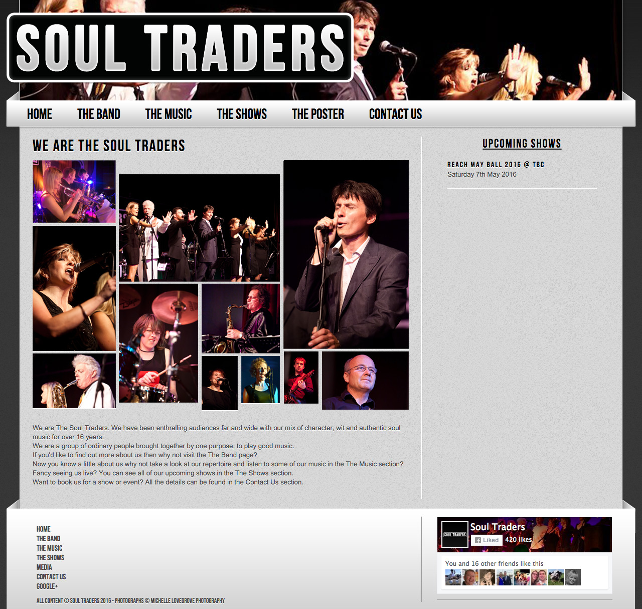
The old homepage of the soul traders site. There is a massively inefficient use of space on this page. Also, the main content that describes the band is cramped down near the very bottom. The entire right column remains mostly blank, depending on the number of gigs we played.
The old homepage was kinda clunky, and one of the major problems with this stuff is finding something meaningful to write on them. So, this time around I opted for writing more or less nothing. The old site itself was very inefficient on space; as I said, this was one of the last sites I ever made that had a fixed with layout, with good reason. Instead of resizing the layout to make the most efficient use of space that I could, I just ended up have tons of wasteful whitespace. On this new design I’ve kept all of that to the bare minimum. The entire page is a large slideshow with a large band name superimposed over the top and little bits of text where needed. I’ve even added a small call to action button in there, which seemed like a natural addition to this layout. All in all, I’m pretty pleased with this one. Next, onto the about page
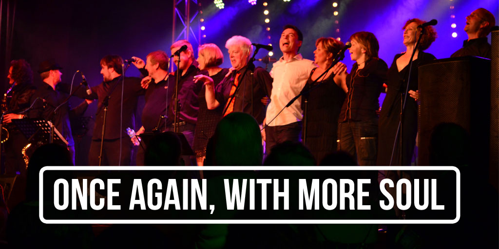
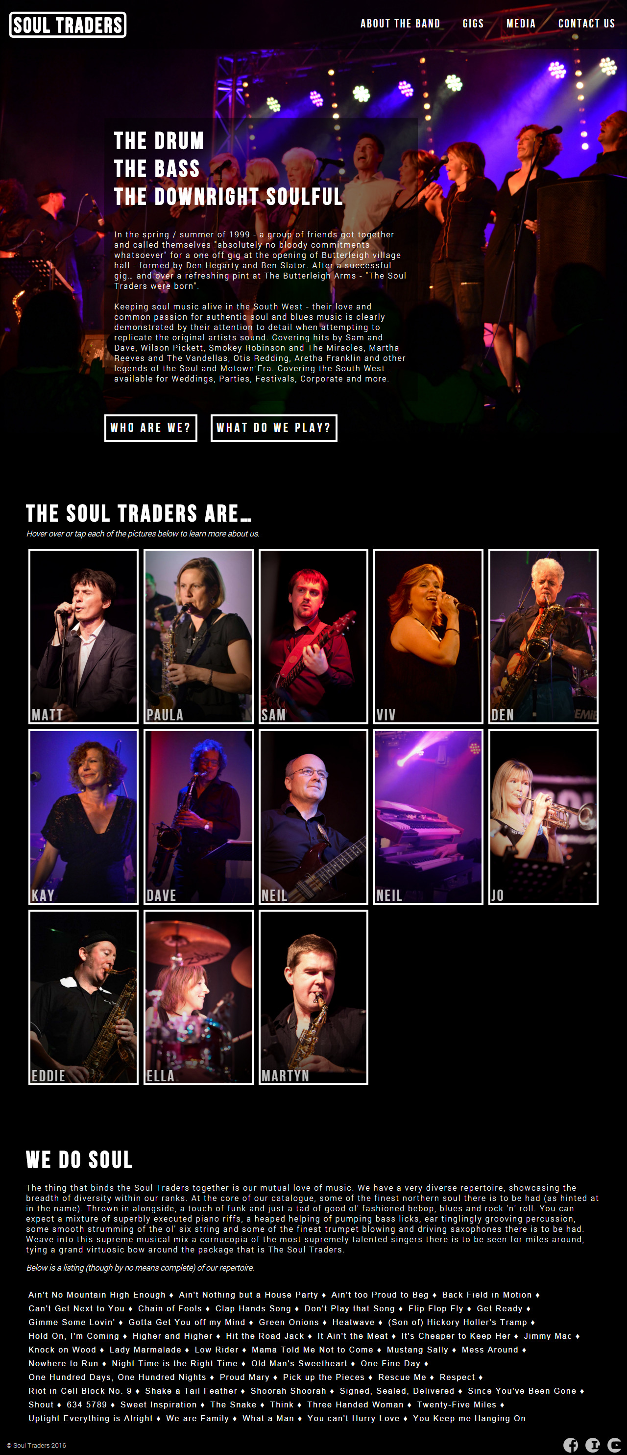
The brand new homepage of the soul traders site. The whole page has an attention grabbing image slideshow at its heart. The rest of the page contains only what it has to. A menu bar, a big logo so people know who we are, a little bit text to entice the visitor, and a convenient call to action button that will funnel the visitor to the about page to learn more about us. Also, there’s a very minimalist menu at the bottom which just sits inconspicuously unless you go looking for the social icons.
The About Page
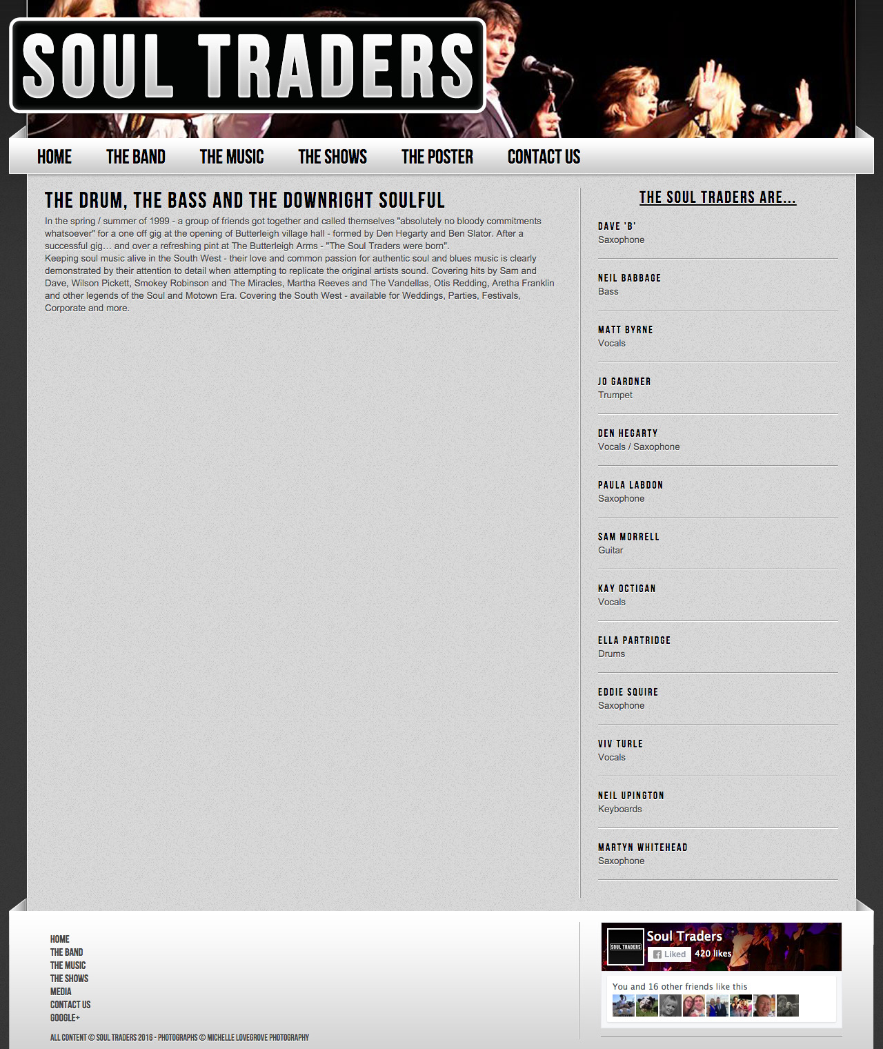
The old about page for the site. Once again we have the same story as with the home page. Relatively little content for the space that’s being presented.
Before we had a load of pages with text strewn across the site, and the about page actually had very little content on it. As I said before, this is a common theme across the whole website. We were very content sparse. The lack of content on this page is only exacerbated by the menu down the right hand side, which stretches out the length of the page. This is a stupidly inefficient use of space. Not only does this hold true for the about page, but the band profiles are all separate pages, which also makes those pages look dull and uninteresting. All in all, pretty drab and disappointing really. Let’s see what we’ve got now.
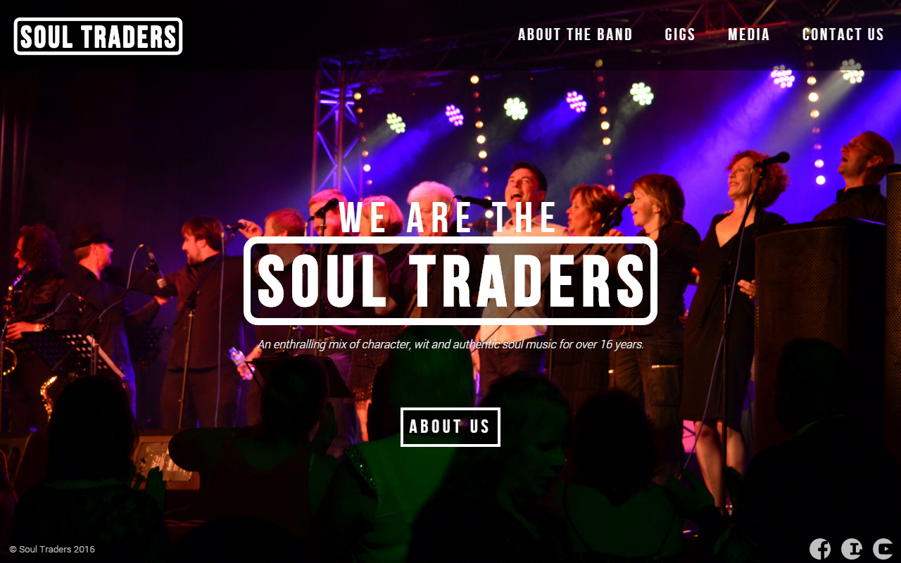
The new about page. This unifies several previously awkwardly empty pages into one unified, well laid out page.
What an improvement! The big selling point of this new design is that we’ve taken about 15 previously mostly blank pages and combined them on to a single, content-rich page. We begin at the top filling the window with a single image and the content from the old about page. Just to guide the user down, we have two buttons which will scroll to the appropriate parts of the page. Instead of having a page with a block of text and a small image for each band member, we’ve now made the image the main event, placing them all front and centre. When you hover over the image with your cursor, the image flips over to show the band members’ bio. This is accomplished with some nifty 3D CSS transforms and a little snippet of Javascript. Finally, we’ve merged the songs page on the end. So this page tells us about the band, who is in it, and what we play. Just to think, this used to be spread out over 15 pages. Madness.
The Gigs
This was always one of the stronger parts of the old site. Summarised on a page was all of the information about a given gig. Included in this was pretty much all the information anyone would need (apart from the time, which I never got around to fixing). The high point of this page was that if each gig had a location, it would show up as a marker on a massive Google Maps embed. Finally, a page that’s not totally wasting space! However, once again, the right column is left looking barren for most of the time.
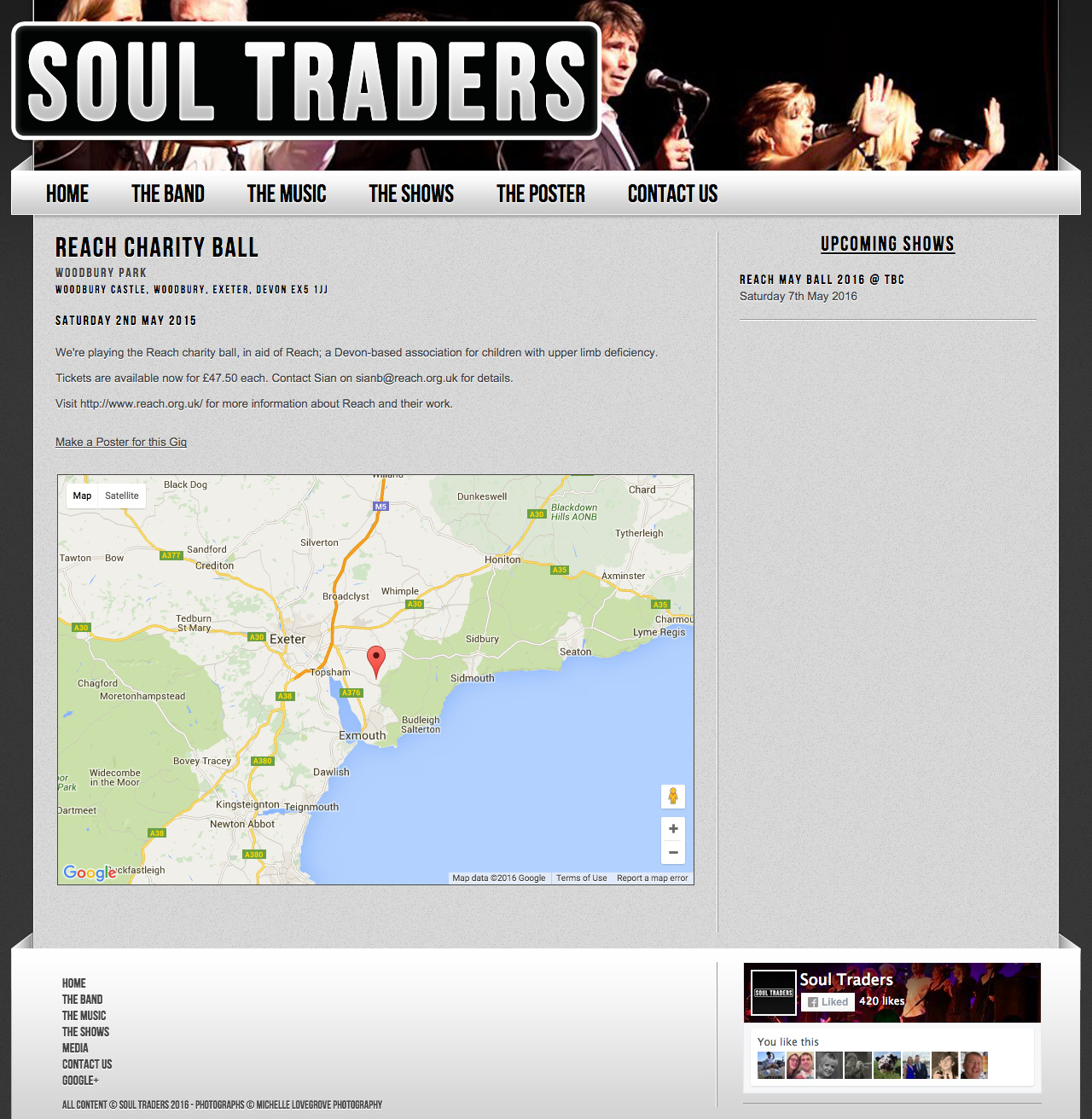
The old gigs page is not the worst page on the site by far, but it could still use ample work. Firstly, the menu down the right is a super inefficient use of space. Also, it would be great if we could make more of the visually interesting, and actually really useful, map.
So what did I do with this page? I went way out of the ballpark of what I was expecting and just decided to make the whole page one giant Google map. The contents of the map depend entirely on what’s on the page. For example, the image shown below is all the gigs we’ve ever done while the site has been around (until now at least) plotted on the map. If we click on one of those gigs we go to the single gig page, and we zoom right in to just have a single point on the map. If you hover over a gig, the corresponding pip jumps and if you hover over the pin, the corresponding gig in the box on the left flashes. So you can easily tell which gig is which. Also, I’ve got to great lengths to make the URLs for each gig as friendly as possible. For each gig we have the date and a slug that describes it, so for example the URL of reach charity ball shown above would be http://www.southernsoultraders.com/gigs/2015/05/02/reach-charity-ball/. On the single gig page, everything has been simplified right down. We now have a box with the details in it and large call-to-action buttons where needed. So far I have three call to actions that can be there: Show on Google Maps, Get Tickets and Facebook Event. The buttons are self explanatory really. These are here because it really just puts everything anyone could want for a given gig on a single page. It’s really convenient.
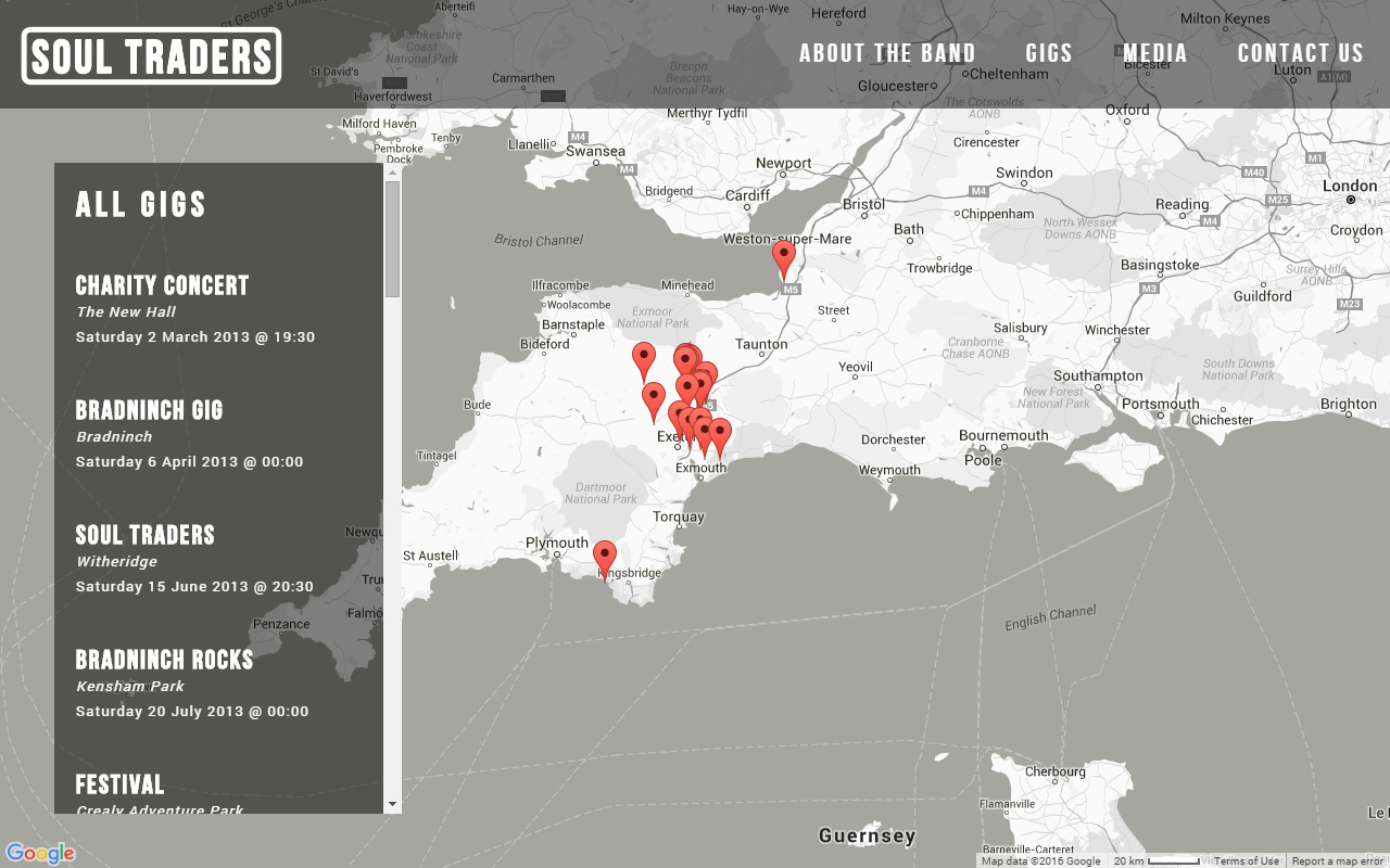
The new gigs page capitalises on the high visual impact of the map by making it front and centre. The markers correspond 1:1 with the gigs shown in the list on the left.
The Media
Once again, another startlingly profound misuse of space. This page was one of the ones that got killed off in favour of the condensed about page, Once again we are greeted with a wall of text, which is just really dull. On the right we have some visual interest added by the icons, but this is still far from the best way to represent the information we’re displaying here. The most painful part of this page is the song list. Just one single column of songs is an absolutely dire use of horizontal space. How do I handle this now?
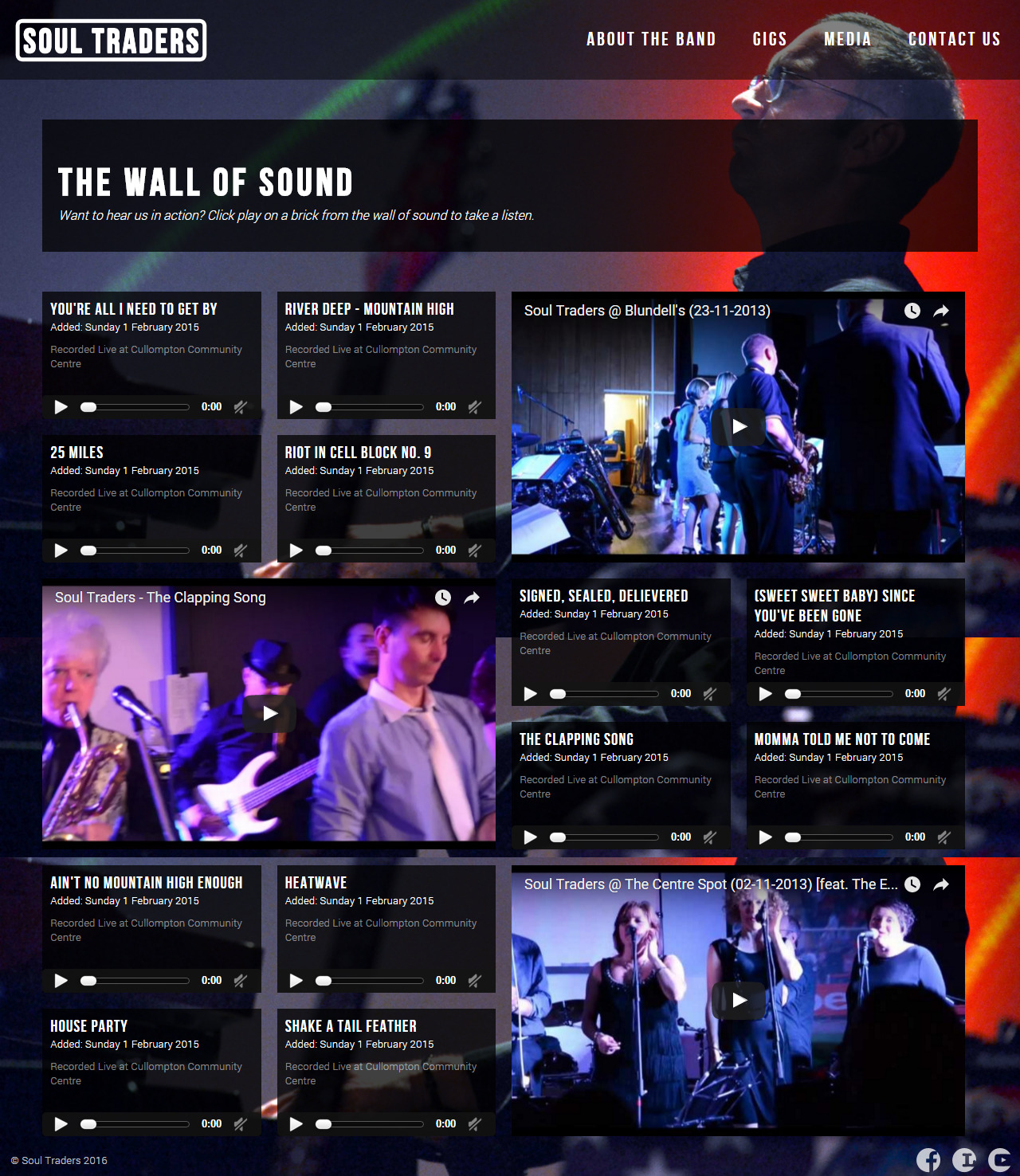
Instead of a wall of text, we are once again greeted by a completely redesigned page. Instead of the inefficient text based list which linked off to content on separate pages, I instead opted for just laying it all out in a grid. This is where Freewall.js comes in, as it actually lays out all of the media elements on the page for me according to a grid that is defined in the file. The audio players are fundamentally the same as the previous site, as they are just media elements. However, it’s hard to deny that it’s much more nicely and efficiently presented.
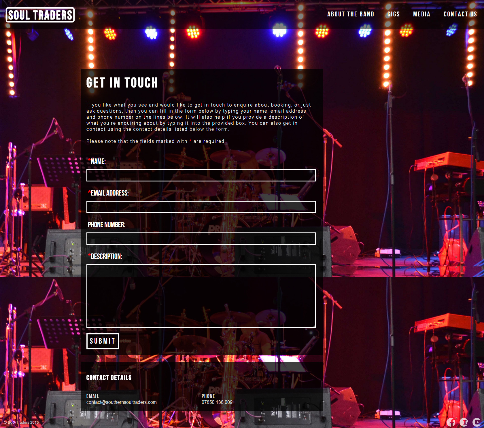
Contact Us
Of all the pages, this one has probably seen the least radical a facelift. This form allows a user to the site to contact us. Simple as that. Overall, this page is pretty well laid out. The main area of the page is filled with useful content. The only let down is once again that area at the side.
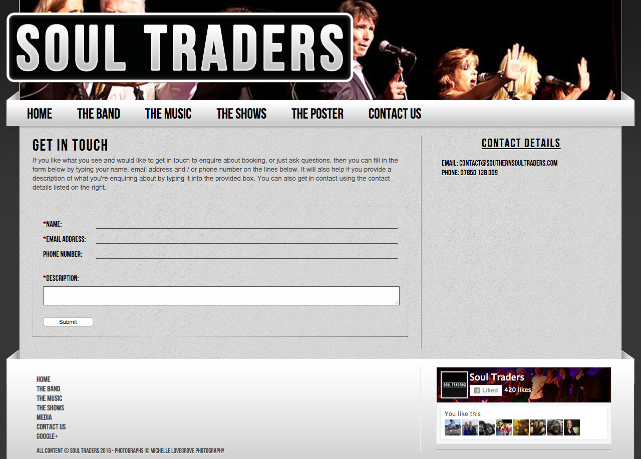
Although there haven’t been as many changes compared to some of the other pages, this one still benefits from the new treatment that we’ve been giving to everything.
The new page has a layout reminiscent of the old one, but this time we maintain the theme of having a nice background image on the site. Everything is laid out with more spacing and the form is less crowded. We also retain the bold, minimalist aesthetic that is throughout the entire site. Once again the sidebar is gone, and instead that has been moved to the bottom of the page.
Conclusion
I think that just about covers the new site. There were unfortunately some losses in the new site, most notably of which was the poster maker. The band members complained a while ago about people having trouble when advertising our gigs as there wasn’t an easy way to make a band poster. So I made a neat little script using TCPDF which put together using inputs that people put in, such as the location, date and a brief description. Unfortunately, it never got used so I didn’t include it in the re-design. The massive footer also got the chop. The Facebook like pane never really fit in with the site and was pretty much just a way to fill some empty footer space. It’s instead made way for a really minimalist footer which actually serves a useful purpose.
So, there you have it. Please feel free to let me know what you think if you have any constructive feedback. I’m always looking to hone things down. You can contact me on the site, or even better just shoot a mention to @smorrell on Twitter. Thanks again for reading and I sure hope you’ll drop back again soon when I’ll hopefully have another exciting project to write about.
Update: While I was writing this article members of the band contacted me to see if I had a poster. Long story short, a re-written poster maker returns soon. I might do a post about working with TCPDF at some point, as it’s a really useful and flexible tool.
